
Ambigrams
The word ‘Ambigram’ is a composite of two latin words: ambi = both (or both sides), gram = word. The most common manifestation is a graphic or stylized script that has biradial (or order 2 rotational) symmetry. The type of symmetry we normally think of is bilateral symmetry, like a mirror. Biradial symmetry means that, as an image is rotated 360 degrees, it is identical twice: once at 0 degrees, then again at 180 degrees. Radial symmetry goes further with greater orders and can be found in nature. A starfish has pentaradial (or order 5 rotational) symmetry.
I first learned what an Ambigram was when I read Angels and Demons by Dan Brown. John Langdon was commissioned to create ambigrams that appeared prominently in the story. John created several ambigrams that employ a heavily stylized gothic script spelling a word that is identical when rotated 180 degrees. It came as no surprise that I was compelled by these images that live at the intersection of art and math, and was inspired to learn more.
John’s work for the novel featured ambigrams that employ biradial symmetry, but I soon learned that others were creating ambigrams with different types of symmetry, including some artists that were using the idea of biradial symmetry, but the rotated version spelled a completely different word. As such, there is no symmetry, but the artistic challenge and potential outcome is compelling in a different way. I thought I’d try my own hand at it.
I was approached by a colleague who wanted a tattoo designed with the words: Forgive / Grow. One can wax poetic about the notion that such a graphic could only exist via the combination of these two words and is perhaps more meaningful because of it. Another colleague asked if I might create one that was a combination of his and his wife’s names. He was also compelled by the idea that such a graphic could only exist via a combination of their two names, and by the romantic notion that the two names were therefore inseparable, and by extension, their union. Since then, I’ve created them as wedding presents.
As I work through each piece, trying to find common strokes for the letters in each orientation, an overall character tends to emerge. Perhaps it’s partly inspired by the subjects themselves, or perhaps it emerges from the shapes that tend to be prominent.
Forgive / Grow takes on the look of a graffiti tag or street art. Chris / Nicole feels flowing and decorative, appropriate for two music theatre performers. Meiwen / Megan looks psychedelic or perhaps like stylized script from a graphic novel. Sean / Claire appears like a wisp of smoke and is one single stroke from start to finish. Tom / Tammy takes on a character that reminds me of Native Canadian art. In fact that’s what they thought it was when I gave it to them. Jeffrey / Douglas is again a single unbroken stroke with a delicate flowing feel.
Interactive Gallery

Forgive / Grow
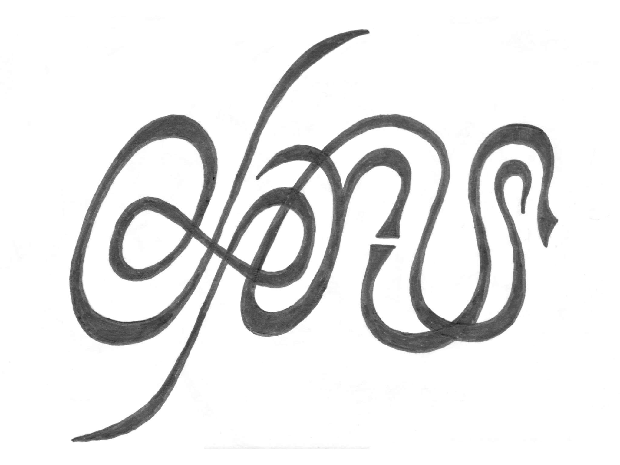
Chris / Nicole
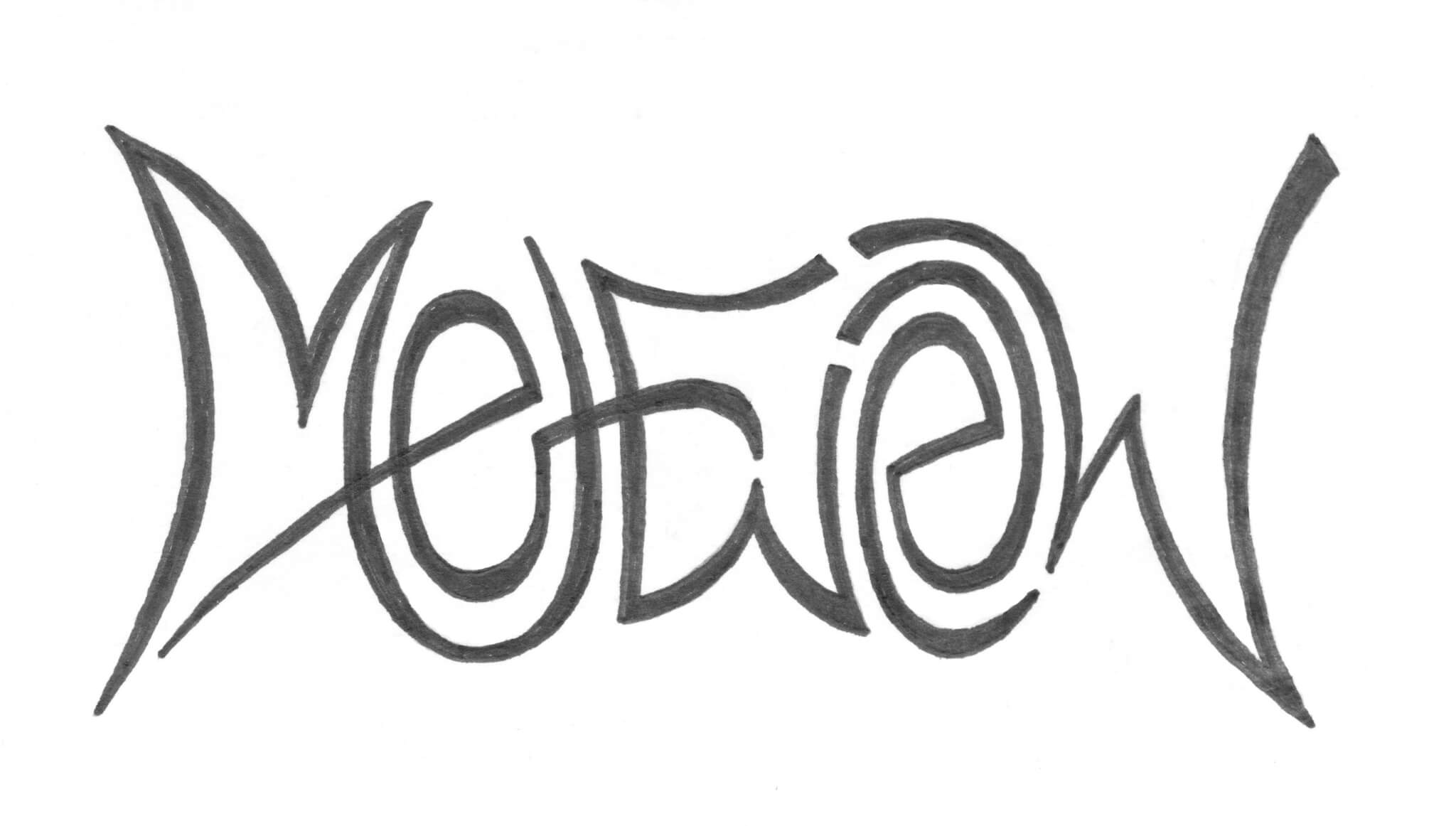
Meiwen / Megan
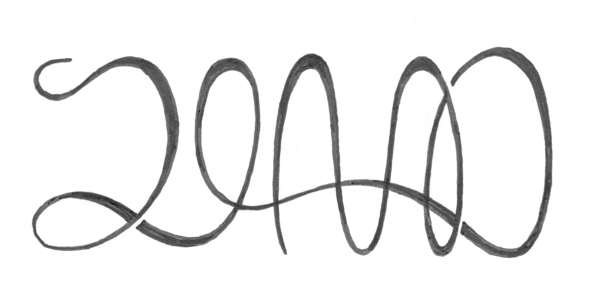
Sean / Claire
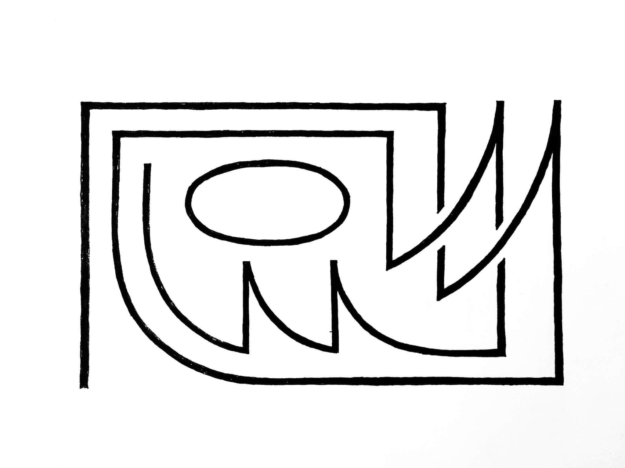
Tom / Tammy

Jeffrey / Douglas